

纯CSS+HTML实现圆圈+箭头动画
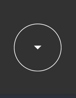
今天分享一个纯 HTML + CSS 实现的圆圈+箭头动画。100vh 高度,通过 jQuery 控制每次滚动一屏的网站风靡一时,在第一屏的页面底部中间,可以考虑加上这个动画,提示可以往下滚动。
如果引入了 Fontawesome 之类的字体,那么箭头伪类可以替换成更好看的样式。
以下是 HTML 代码
/* html sample */
<html>
  <head>
  </head>
  <body>
    <div class="container">
      <div class="arrow"></div>
    </div>
  </body>
</html>
以下是 CSS 代码
/* 用于滚屏,居中下部 */
body {
  margin:0;
  padding:0;
}
.container {
  height:100vh;
  background:#333
}
.arrow {
  opacity: 1;
  animation: arrow 3s cubic-bezier(0.5, 0, 0.1, 1) infinite;
  -webkit-animation: arrow 3s cubic-bezier(0.5, 0, 0.1, 1) infinite;
  transform: rotate(-90deg);
  -webkit-transform: rotate(-90deg);
  position: absolute;
  bottom: 10px;
  left: 50%;
  margin-left: -30px;
  width: 60px;
  height: 60px;
  border-radius: 100%;
  -webkit-border-radius: 100%;
  line-height: 60px;
  text-align: center;
  font-size: 20px;
  color: #fff;
  border: 1px solid #fff;
  cursor: pointer;
  overflow: hidden;
}

.arrow:hover {
  animation-play-state: paused;
  -webkit-animation-play-state: paused;
}

.arrow::after {
    content: '';
    display: inline-block;
    width: 0;
    height: 0;
    border-left: 5px solid transparent;
    border-right: 5px solid transparent;
    border-top: 5px solid white; /* 箭头的颜色 */
    position: absolute;
    left: 50%;
    top: 50%;
    transform: translate(-50%, -50%) rotate(0);
}

@keyframes arrow {
  0%, 100% {
    transform: translateY(0); /* 动画开始和结束时元素在原始位置 */
  }
  50% {
    transform: translateY(-20px); /* 动画中间,元素向上移动10像素 */
  }
}
实际效果预览:
想自己上手改改的,Codepen 代码点这里
